See the following links if you'd like to skip to specific sections.
- #1. Responsive Web Design
- #2. Content: Placement & Quality
- #3. Call to Action
- #4. Navigation
- #5. Blogs
- #6. Generous Use Of Whitespace
You literally just have a few seconds to grab the attention of the viewers of your website and urge them to buy what you are selling- be it a service or a product.
Here are a few most important tips to improve the website design, not only to get the desired attention of the viewers of your website, but also to improve your ranking on search engines like Google.
#1. Responsive Web Design

With the advancement in technology, viewing websites is no longer limited to desktops.
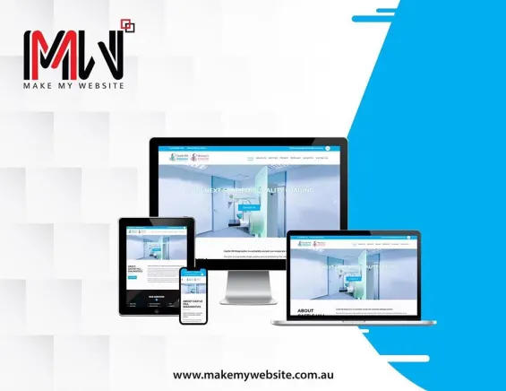
Having a responsive web design means your website will be adjusting itself according to the size of the screen- be it a 27-inches Mac or a 12-inches Laptop screen; along with the type of browser which is being used by the website users.
If the website has responsive web design, the layout will perfectly appear on all the browsers including but not limited to Google Chrome, Mozilla Firefox and Internet Explorer.
Your website would certainly need a responsive web design if either it is an outdated website or the new one with this feature lacking.
You certainly would not want the users of your website to get a wrong impression by looking at the displaced content and layout due to your website’s non-responsiveness.
When we talk about responsive website design, there is another factor that comes in, which is having a mobile-friendly website.
The latter means that the website will be fully functional with the perfect layout as it is on the desktop, both on mobile and tablet, i.e. being mobile and tablet responsive. Therefore, this is a very basic yet important tip that should not be missed at any cost.
#2. Content: Placement & Quality

Improving this bit is very important, considering that the users can only get your message right if the content is clear (Quality) and is placed rightly in the layout (Placement).
One thing that you must bear in mind is that most of the users would read only a little percentage of the entire content in the first place- and that is your chance to grab all their attention.
The best way is to get your mission statement to portray your business in the best manner. Make sure that your message is loud and clear, easy to find and read, and is not scattered or served with too much of it.
#3. Call to Action

Call to action the button is a must-have! It is flashy, strong, and influences the user to act. The potential a call-to-action button has often is underrated. Some websites skip adding this, but realize its need in the future. Hence, it is one of the important tips you must consider and act upon. There can be a various call-to-action buttons, but a few of them are-
1- Get a Free Quote
2- Download your e-book
3- Call us Now
4- Enter the Webinar
5- Join our mailing list.. And many more!
#4. Navigation

If you are reading this, you either are looking to update your website as a routine process or are not happy with the results. If the latter is the case, navigation can be one of the reasons why your website is not performing well.
Every user who lands on your website would stick around for a maximum of 3 seconds in the first place, and this duration is enough for the user to decide to scroll through more on your website or to bid a quick goodbye.
If the navigation is not smooth and easy, you would see the user bouncing back and certainly avoiding hopping on your website again. Therefore, navigation ought to be proper so that the user scrolls through your website for a good while without having a hard time.
#5. Blogs

Blogs are meant to educate and inform the audience, but they also strongly contribute to the visibility of your website.
Writing and publishing blogs with relevant content regularly adds on to the fresh content, which sends a positive sign to Google to rank your website higher- because of obvious reasons.
SEO-friendly blogs, wherein the keywords are administered and used ethically in the text, gradually come up in searches and enhance your website performance.
They are also a medium to engage your audience visiting your website or on social media, where you would share these blogs to educate and interact with them.
#6. Generous Use Of Whitespace

Cluttered content is a big no when it comes to creating an impressive website design. The whitespace is the area left blank on the layout of the website.
It is basically the empty area between all the design elements, that include images and graphics, text, columns, margins, etc. The use of whitespace should be wise, as it affects the overall design of the website.
If you are looking to improve your web design for obvious reasons, here is an important point of contact for you. If the whitespace is used wisely, your website will start to look more organized, clean, and professional.
The elegance in web design is required to have your viewers to stick around and not get confused by a bombardment of wrongly placed content.
Whitespace or negative space makes the web design smooth, clear, and loud. The catch here is to have a balance between the content, its placements, and the whitespace.
Now that we term the negative space as “whitespace” it does not mean it has to be white.
You can choose any color which is the background color of your website according to its design, and use it in the empty space to have a perfect layout with a smooth, organized, and professional website design for an improved outlook.
So now you get the best tips for improvement. Apply them now and grab the user to your website.
Read Next
The following articles are related to top 6 tips to improve your website design.


Useful Information. Thanks for Sharing.