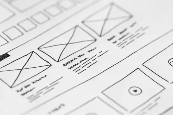
This post is structured as follows.
You might think that a template is all you need to develop your web presence. Real estate companies, after all, are judged based on their merits, experiences, listings, and communication styles.
Who really believes that?
These days, one of the first things those potential clients are going to see is your website. Whatever your business is, it is your website that will bring you to the customers' and clients' consciousness.
Here is the thing: the easiest thing to do is pick a template, customize it, build upon it using a great tool like a small business website builder, and publish it on the internet. Most templates will allow you to change the colors, backgrounds, and photos.

It will feel like the website is made just for your business. You know it is not. If you look and browse around long enough, you will notice the similarities between these web designs.
Everyone will see them, too, and realize you are all using the same templates.
A good web design must match the personality of the business. A great real estate company should be comfortable enough in investing in the right web design.
Everyone knows that the challenge for businesses right now is not only to offer great products and services but to be competitive enough that they will be a standout in the realm of whatever industry they belong to.
Potential property buyers want to know about the real estate companies from which they are planning to buy a property.

While most home loan brokers can share information about real estate companies they have worked with in the past, clients want to see for themselves what these companies can offer.
Therefore, web design is the very first big investment that real estate businesses should make.
Parallax Scrolling
This has become popular in recent years because it is simple and easy to use. When the user scrolls down, the series of images on the background will change.
The effect is that of floating content, which makes it easy for users to find the information they need.

They do not have to switch to another web page and go back to the main menu. Everything they need is on that one page alone.
Textured
The use of 3-D elements and patterns will create a dynamic-looking website.

This is a web design for real estate companies that sell modern and contemporary properties. Most web developers will use a simple menu for a textured web design so as not to make the navigation confusing.
Corporate
This is the most straightforward web design for real estate companies. It highlights all the important information about the company, including the brokers under its wings, the owners, and the listing.

It has clean lines, traditional colors, and a professional design that will be attractive to most property buyers. Not only that, but it is a professional design without any fuss. Its message is clear: what you see is what you get.
Minimalist
If your idea is to focus on the imagery of the properties that you are selling, then the best fit is a minimalist design. This will maximize the impact of the images of the properties you are selling.

This kind of style, though, is great for luxury listings. Meaning, you would have to wow your audience with the sweeping lines and magnificent architecture of the properties.
Flat
If you are trying to save on web design fees, a flat design is a scaled-down version of contemporary and corporate design.

It uses solid colors only and with nary the complex design elements of textured and animated web design. Flat designs take pride in their uncomplicated layout.
Elegant
The web design can only be truly elegant with the right high-resolution photos. How can your website be elegant without the accompanying photos of gorgeous properties?
Web designs that use black as their main theme color will fall under this category. Real estate companies that sell luxury properties will want a simple and yet elegant web design to highlight their listings.

Here, web users will feel as if they are transported to the mansions and villas the company sells.
Animation
This kind of web design will take a company's place. It will allow more engagement since it has a fun interactive feel.
Websites that use this kind of web design can play around with design elements and graphics. Make sure that there is a call-to-action prominently displayed since web users can get distracted by the animation.

There are many fantastic web design options for businesses, but the important thing is to know what will advertise and market your products/services better.
Real estate companies, have to shine the light on their listings, as well as make the site easy to navigate for their picky customers. Whatever will achieve these two goals is the perfect web design for them.
Read Next
The following articles are related to 7 best web design ideas for your real estate company.


Hi, There Thanks for sharing this. I have read this full article. Really, It is very informative for web design.